Visual identity
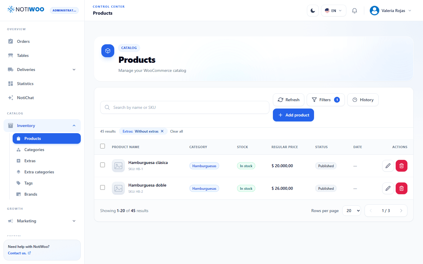
The app and docs now share one product language: blue primary actions, slate surfaces, strong typographic hierarchy, quiet borders, and generous radii.
Main palette
| Token | Value | Use |
|---|---|---|
| Primary | #2563EB | Buttons, active navigation, and focus. |
| Strong primary | #1D4ED8 | Hover and emphasis. |
| Cyan | #06B6D4 | Complementary accents and states. |
| Slate 950 | #020617 | Headings and dark background. |
| Slate 500 | #64748B | Secondary text. |
| Slate 200 | #E2E8F0 | Light borders. |
| Slate 50 | #F8FAFC | Light page background. |
Shape and typography
Main surfaces use 20–24 px radii; fields and buttons use 12–16 px. The system sans-serif stack keeps loading fast, with 800–900 heading weights and readable body text.
Light and dark
Light mode uses white on slate 50; dark mode uses slate 950 and 900 with blue 400 accents. Meaning never depends on color alone.
Shared components
Reusable page, header, surface, toolbar, search, button, badge, toast, pagination, modal, confirmation, and drawer primitives keep modules consistent.